Composition
Composition Analysis
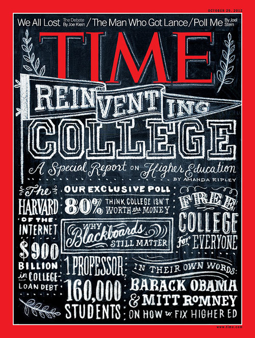
This typographic composition was a cover done by Dana Tamachi for TIME magazine using her iconic medium of chalk for an edition about a college research report. The decision to have Tamachi make this cover was intentional as chalk is commonly associated with education and provides a unique texture that digital type cannot replicate. There are various different typefaces, sizes, and weights she uses to provide contrast in the type for all the sections of information she needed to fit onto the cover. Using graphics and elements like dots she separates the information from everything else to make the composition busy but organized which was likely an intentional design choice to relate back to the theming of college.
The size and spacing of all the text makes it clear what the hierarchy is meant to be going from the magazine title to the featured article title and then tertiary information. Furthermore, the TIME magazine title contrasts with the black and white chalk to make it stand out to the viewers eyes due to its red color. Overall, the different typefaces chosen ranging from scripts to decorative fonts give a very nostalgic and handwritten feel.
The size and spacing of all the text makes it clear what the hierarchy is meant to be going from the magazine title to the featured article title and then tertiary information. Furthermore, the TIME magazine title contrasts with the black and white chalk to make it stand out to the viewers eyes due to its red color. Overall, the different typefaces chosen ranging from scripts to decorative fonts give a very nostalgic and handwritten feel.